Solving adoption problems of a data-oriented industrial optimization tools
The Air Liquide R&D team developed a model that simulates the processes that take place in any gas production plant. It allows to generate optimized production plants that could save millions in power consumption.
Inception
Despite the model precision and efficiency, the project team was struggling with adoption. They provided initial training sessions but most trainees were not able to implement the solution for their plant. And those who did needed 4 weeks to have a first working version.
“Only 1 in 10 plant manager that we train manages to get a working plant model.
And it takes them 4 weeks to do it.”
Discovery
I conducted a few interviews with former trainees, both successful and struggling. I wanted to understand what were the difficulties with using the tool, but also what actually worked.
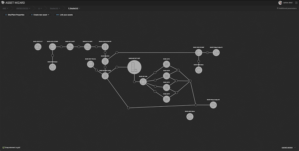
The tool requires the user to upload an Excel configuration file that describes all the equipment in the plant and how they are connected to each other.
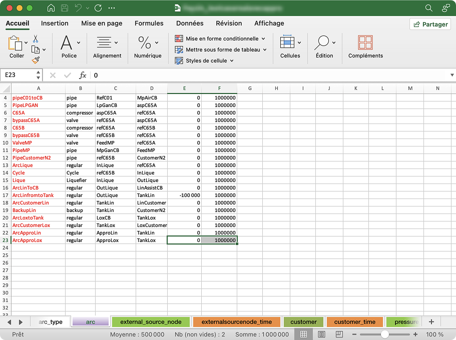
Basically, users have to manually create a relational database.
In itself, it is a very frustrating task, but it is even more difficult when they have to iterate and make changes. Any minor inconsistency or error will prevent the model from working. And error messages are not necessarily clear enough to point where the error is.
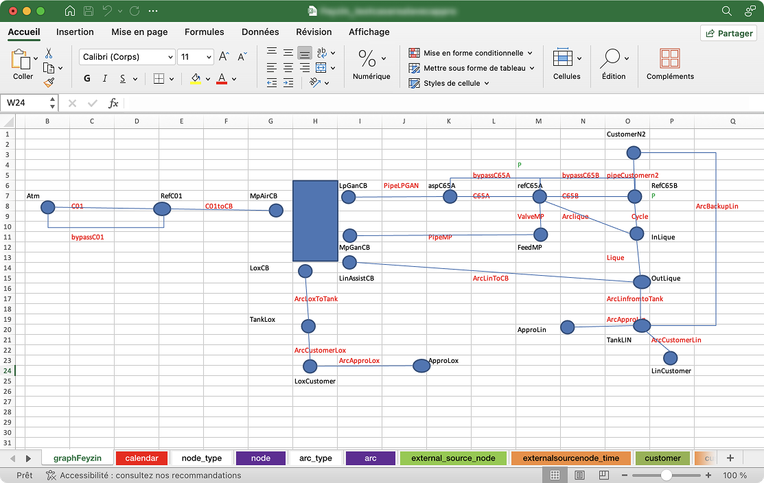
User reported that creating this diagram was the most gratifying part of the process. But unfortunately, it is not used by the optimizer.
Ideally, they shouldn't have to enter everything manually, because all the necessary structural information is already there.
Prototyping
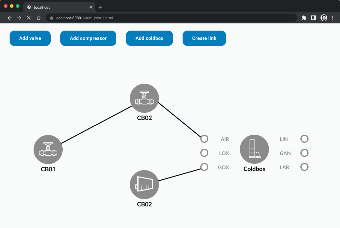
As a former developer, I know that kind of UI can be challenging to implement from scratch. So I tested different technical possibilities and libraries.
I discovered JointJS, a very versatile library aimed at creating interactive diagrams.
So I created a simple prototype to test feasibility and explore different user interactions.
Design process
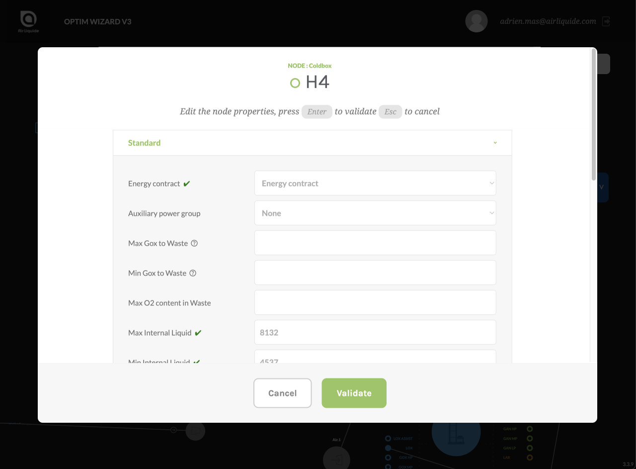
I wireframed and designed a two-phases workflow : first create the diagram visually, then input technical details for each piece of equipment.
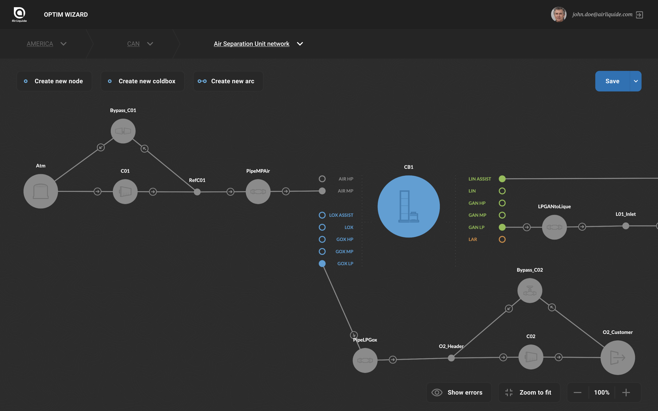
The input forms adapt each field to its data type, providing help to understand the nature of the information needed and where to find it.

Developer Collaboration
I worked closely with development team to transfer my experimentations with JointJS and design specifications.
During the project, I regularly organised Design Reviews with developers. This is the perfect occasion for them to give their feedback on feasibility, ask about UI interactions, and it usually improves developer's involvement in the project.
User testing
After a few months of usage, I conducted a few interviews to get feedback and improve the product.
Interviews revealed users struggled to see which equipment lacked inputs.
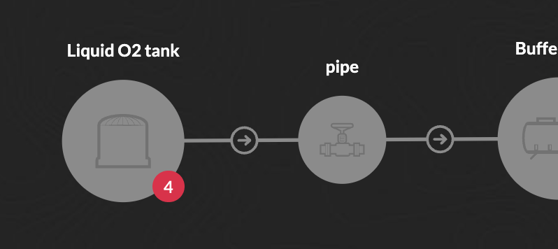
During observation, I also noticed that user often fiddled with the zoom and navigation to fit the entire diagram into view.

Impact
With this new UI, the tool adoption was much better.
Reducing learning time from four weeks to four days, and reducing abandon rate from 90% to 10%.
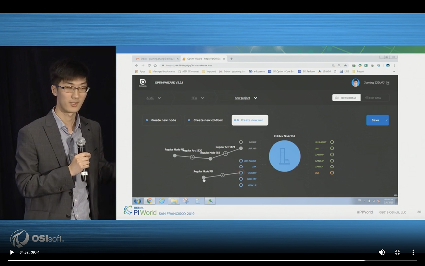
- Deployed in 200+ sites
- in 40 countries
The deployment of the optimizer helped reduce energy consumption in industrial plants and gas network all over the world and save millions each year.
Conclusion
Data‑driven products often overlook ergonomics or UX, considerably slowing adoption.
On my side, it has been a pleasure to experiment with a new kind of node-based interface. From prototyping to collaborating with developers, I always enjoy the challenge of creating something new.